

Table of Contents
- Understanding Colour Theory for Interior Design
- Assessing Your Room's Existing Colour Palette
- How to Choose Wall Art for Your Living Room
- Digital Colour Matching Tools for Home Decor
- The Impact of Lighting on Colour Perception
- Hanging and Positioning Your Canvas Print
- Common Mistakes to Avoid
- Conclusion
Last Updated: August 15, 2026
Understanding Colour Theory for Interior Design
Colour theory forms the foundation for matching canvas prints to your room's aesthetic. The colour wheel, a visual representation of colour relationships, gives you a framework to make confident decisions about which prints work best in your home.
The colour wheel and complementary schemes
The colour wheel organizes hues into relationships that either harmonize or contrast. Complementary colours sit opposite each other on the wheel: blue opposite orange, red opposite green, yellow opposite purple. When placed side by side, they intensify each other visually.
For canvas prints, complementary schemes create visual excitement. A print featuring warm orange tones will pop against cool blue-grey walls, but this works best when one colour dominates and the other acts as an accent. If your walls are neutral grey and your furniture is cream, a coastal print with vibrant turquoise water and sandy beach tones will anchor the room without overwhelming it.
Analogous colour schemes use colours that sit adjacent on the wheel: blues, blue-greens, and greens together. These combinations feel harmonious and restful because they share similar undertones. If your room features soft sage green walls and cream soft furnishings, a landscape print with muted greens and earthy browns will blend seamlessly.
Warm versus cool tones
Every colour carries a temperature. Warm tones, reds, oranges, yellows, and warm browns, evoke energy and coziness. Cool tones, blues, greens, purples, and cool greys, suggest calm and spaciousness. Your room's existing colour palette already has a temperature bias, and your canvas print should either match or intentionally contrast with it.
A room painted in warm cream with terracotta accents suits prints featuring warm sunset hues or earthy landscapes. A room with cool blue-grey walls demands prints with cool undertones, such as moody seascapes or cool-toned mountain landscapes. Temperature harmony matters as much as colour matching.
Assessing Your Room's Existing Colour Palette
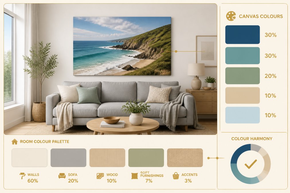
Before selecting a canvas print, audit what's already in your space. Your walls, flooring, soft furnishings, and existing artwork all contribute to the room's colour story.
Identifying wall colour and undertones
Your wall colour is the largest visual surface in the room and the anchor point for everything else. Most walls aren't pure colours; they contain undertones that shift how other colours appear against them.
A wall painted "white" might actually have warm, cool, or neutral undertones. Warm whites lean toward cream or ivory. Cool whites have subtle grey or blue undertones. Look at your walls in different lighting conditions: morning light reveals cool undertones; evening light reveals warm ones. If your walls look slightly greenish in one light and slightly peachy in another, you have a neutral base, the most flexible foundation for canvas prints.
When selecting a print, compare the digital image against your actual wall colour in your room's lighting. Don't rely on your phone screen or laptop monitor alone; these displays have their own colour casts that distort what you're seeing.
Evaluating soft furnishings and flooring
Sofas, curtains, rugs, and cushions form a secondary colour layer that influences how prints appear. A room with a warm beige sofa and terracotta cushions has committed to warm undertones. A print with cool blue-grey tones will feel discordant in this space.

Flooring adds weight to your colour story. Dark wood flooring has warm undertones; light oak has warmer undertones still. Concrete or light tile flooring reads as cool and neutral. Your canvas print should coordinate with at least two existing elements in your room: either your walls and sofa, or your sofa and rug.
How to Choose Wall Art for Your Living Room
Selecting canvas prints isn't just about finding something beautiful; it's about choosing a piece that functions as a visual anchor for the entire room.
Using art as an anchor piece
An anchor piece is wall art substantial enough and visually interesting enough to anchor a room's design scheme. Your canvas print becomes an anchor when it's large enough to command attention, positioned at eye level, and coordinated with at least two other elements in the room. A small 30x40cm print above a sofa might be beautiful, but it won't anchor the space. A 60x90cm print positioned at eye level above the sofa becomes the visual centre of the room.

At paints2prints, prints like the Moonlit Wave Canvas Wall Art work as anchor pieces because their colour intensity and composition draw the eye naturally. When choosing an anchor print, consider what story you want the room to tell. A seascape print anchors a room around coastal calm; a landscape print anchors around exploration and earthiness.
Balancing saturation and contrast
Saturation refers to the intensity of a colour, how vivid or muted it appears. Contrast is the visual difference between light and dark areas within the print. A print with high saturation and high contrast demands visual attention and works well in rooms with neutral furnishings. A print with low saturation and low contrast feels calming and blends easily into rooms with existing colour and pattern.
Avoid pairing high-saturation prints with high-saturation furnishings; this creates visual chaos. Instead, pair high-saturation prints with neutral soft furnishings, or choose muted prints to complement existing bold patterns. Coastal and landscape prints from paints2prints typically use balanced saturation, rich enough to feel vibrant but not so intense that they demand constant visual attention.
Digital Colour Matching Tools for Home Decor
The single biggest challenge in ordering canvas prints online is the digital-to-physical colour shift. Your monitor displays colours differently than they appear in print, and lighting conditions in photos don't match your room's lighting.
Calibrating your monitor for accurate colour
Your monitor has a built-in colour profile that affects how you see digital images. Most consumer monitors default to factory settings that oversaturate colours and shift blues toward cooler tones. View the image on multiple devices (phone, tablet, laptop) and note where colours consistently appear similar across devices.
Many online retailers, including paints2prints, provide print preview tools that let you see how a canvas will look in a room. These tools account for typical lighting conditions and wall colours, but they're approximations. The most reliable way to match colours is to request a physical sample or view the print in person before committing to a full-size order.
Comparing digital images to physical samples
When comparing a digital image to a physical sample, view both under the same lighting conditions. Natural daylight reveals true colours; artificial light distorts them. If the sample looks different from the digital image, trust the sample; that's what you'll receive in your full-size print.
Document the colour differences you notice. If the digital image shows warmer tones than the physical sample, you know the print will be cooler than it appears on your screen. This knowledge helps you make intentional decisions about whether the print will still work in your space.
The Impact of Lighting on Colour Perception
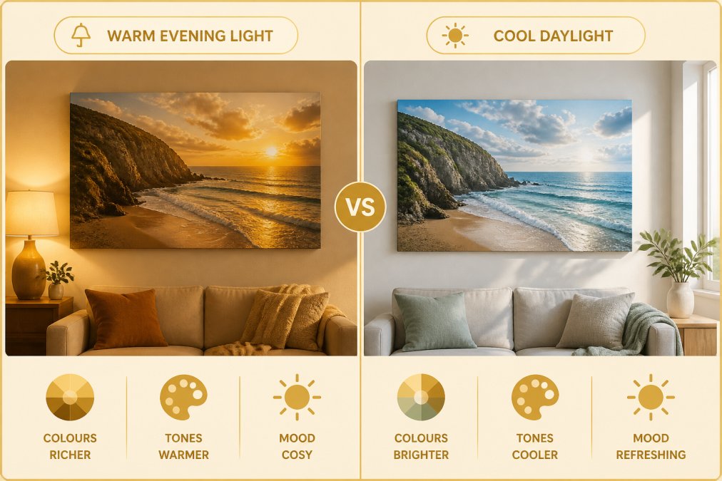
Lighting transforms colour perception more dramatically than any other factor. The same print looks entirely different under warm evening lamplight versus cool morning daylight.
Colour temperature and natural versus artificial light
Colour temperature measures whether light leans warm (orange-yellow, like candlelight) or cool (blue-white, like midday sun). Natural daylight at noon is cool and neutral. Artificial lighting varies widely: traditional incandescent bulbs are very warm; LED bulbs range from warm to cool depending on their rating.
Your room's primary light source determines how viewers will perceive your canvas print most of the time. If your living room gets morning sunlight and you use warm-toned lamps in the evening, the print will appear cooler in the morning and warmer at night. Test your chosen print under all the lighting conditions your room experiences. If you primarily use the room in evenings with warm lamps, view the print under those lamps. If morning light is the dominant light source, assess the print in morning conditions.
Testing prints in your actual room
The gold standard for colour matching is viewing the actual print in your actual room under your actual lighting. Before ordering a full-size canvas, request a small sample or order a smaller version. View it in the exact location where you plan to hang the full-size print.
Pay attention to how the print's colours interact with your walls, furniture, and flooring under different times of day. Does the print's colour palette harmonize with your soft furnishings? Does the saturation level feel right? Spend at least a few days with the sample before deciding. Colours that feel jarring on day one often feel natural after your eye adjusts
Hanging and Positioning Your Canvas Print
Where you hang a print matters as much as which print you choose. Positioning affects how the print functions in the room and how viewers perceive its colours.
Eye-level placement and focal point creation
Eye-level placement means the centre of the print aligns with eye level when you're standing in the room, approximately 150-160cm from the floor. This is the natural focal point for human vision. Prints hung at eye level feel integrated into the room; prints hung too high or too low feel disconnected.
Eye-level placement ensures your print functions as an anchor piece. When the print sits at the natural viewing height, it organizes the visual hierarchy of the room around it. A print positioned at eye level above a sofa becomes the visual centre of the room, and everything else, wall colour, furniture colour, rug colour, should support this focal point.
Gallery wall arrangements
A gallery wall is a collection of prints arranged together to create a larger visual composition. Gallery walls work beautifully for displaying multiple coastal or landscape prints from paints2prints, but they require careful colour coordination.
In a gallery wall arrangement, the prints should share either a consistent colour palette or a consistent theme. Mixing warm and cool tones creates visual discord. Instead, group prints by undertone temperature: all warm-toned coastal prints together, or all cool-toned landscape prints together. Aim for 5-10cm of space between frames. The centre of the overall gallery wall arrangement should sit at eye level.
Common Mistakes to Avoid
Ignoring undertones is the most frequent mistake. A beautiful teal print with cool undertones will clash with a room designed around warm terracotta and cream, even though both colours are aesthetically pleasing in isolation.
Choosing prints based solely on digital images leads to disappointment. Always request a sample or order a smaller version first. Hanging prints too high makes them feel disconnected from the room. Eye-level placement is essential for prints to function as anchor pieces.
Pairing high-saturation prints with high-saturation furnishings creates visual chaos. Either choose muted prints to complement bold furniture, or choose bold prints and keep furnishings neutral. Neglecting lighting conditions is why people think their print looks nothing like the product photo. Test the print under your actual lighting before committing.
Ordering the wrong size leaves you with a print that either disappears into the wall or overwhelms the space. A print above a sofa should be about two-thirds the width of the sofa.
Matching canvas prints to your room's colour palette requires understanding colour theory, assessing your existing colours, and testing prints in your actual lighting. At paints2prints, our curated collection of coastal and landscape prints is designed to coordinate with a range of room styles. With customisable sizes, framed or unframed options, and free shipping to the U.K. and E.U., you can confidently select prints that enhance your home. Start by ordering a smaller sample or different size to test how a print looks in your space before committing to a full-size version. This approach eliminates the guesswork and ensures your canvas print becomes the anchor piece your room deserves.
Frequently Asked Questions
How do I ensure canvas prints match my room colours when ordering online?
Check your monitor calibration first, then compare the digital image against physical samples of your room's wall colour and soft furnishings. Use colour matching tools to identify the print's dominant hues, then verify these sit naturally within your existing colour palette. Test lighting conditions in your actual room before purchasing, as artificial light shifts how colours appear. Many people find taking a photo of their room and overlaying the print image helpful for realistic comparison.
What's the best way to use colour theory when selecting wall art for a living room?
Start with your room's dominant colour, then choose artwork that either complements it (opposite on the colour wheel) or harmonises with it (analogous colours nearby). Consider the 60-30-10 rule: your walls form 60% of the colour scheme, soft furnishings 30%, and wall art 10%. This ensures your canvas print enhances rather than clashes. If your walls are neutral, use the print as your colour anchor. If walls are already bold, choose artwork with softer saturation to maintain visual balance.
Will the colours in a canvas print fade over time?
High-quality canvas prints like those from paints2prints use UV-resistant inks and poly-cotton blends designed to resist fading. Placement matters: avoid direct sunlight for extended periods, as this accelerates colour degradation in any print. Prints in living rooms with controlled lighting typically maintain their colour for many years. If concerned about longevity, choose a print from a reputable supplier who guarantees print durability and uses archival-quality materials.
How does lighting temperature affect how my canvas print looks on the wall?
Warm light (below 3000K) makes colours appear more yellow and orange, while cool light (above 5000K) enhances blues and greens. The same print can look completely different under evening lamp light versus natural daylight. Always view your canvas print in the actual room at different times of day before deciding. If your living room has mixed lighting, choose artwork with a colour palette that works across both warm and cool conditions, or position it where it receives consistent lighting throughout the day.
This article was written using GrandRanker
0 comments