

Table of Contents
- Why Canvas Print Colour Accuracy Matters
- Understanding RGB vs CMYK for Canvas Printing
- Step 1: Calibrate Your Monitor for Print
- Step 2: Set Up Soft Proofing for Canvas
- Step 3: Prepare Your Digital File with Correct Colour Profile
- Step 4: Account for Canvas Texture and Viewing Environment
- Common Colour Shift Issues and How to Fix Them
- Conclusion
Last Updated: August 20, 2026
Why Canvas Print Colour Accuracy Matters
When you order a canvas print online, what arrives often looks nothing like the preview on your screen. The blues feel muted. Skin tones shift toward orange. That vibrant sunset becomes muddy. This isn't a fluke, it's the inevitable result of how colour moves between digital and physical worlds.
According to Frameology's 2026 analysis of online canvas printing, most online canvas prints show inaccurate colours due to uncalibrated printing processes. Your monitor displays colour using light (RGB), while canvas prints use pigment and ink (CMYK). These two colour spaces don't map perfectly. Add uncalibrated displays, wrong colour profiles, and variable lighting conditions, and you've created a recipe for disappointment.
The good news: canvas print colour accuracy is entirely within your control. You don't need to be a colour scientist, you need a systematic process. This guide walks you through exactly how to ensure canvas print colour accuracy from start to finish, from calibrating your monitor to accounting for how light hits the finished print on your wall.
Understanding RGB vs CMYK for Canvas Printing
Your monitor displays colour in RGB (Red, Green, Blue). Canvas prints use CMYK (Cyan, Magenta, Yellow, Black), physical pigments that reflect light. These two colour spaces overlap, but not completely. Some colours your monitor can display don't exist in the CMYK gamut.
This mismatch is the root cause of most colour disappointment. A vibrant neon green on your screen might be impossible to reproduce on canvas. Understanding this gap is the first step toward managing expectations and achieving accurate results.
The colour gamut, the range of colours a device can produce, differs dramatically between RGB and CMYK. Your monitor's RGB gamut is typically wider and brighter than what canvas printing can achieve. By converting your image to CMYK early and soft proofing (previewing how CMYK will look), you see what's actually achievable before you print.
Step 1: Calibrate Your Monitor for Print
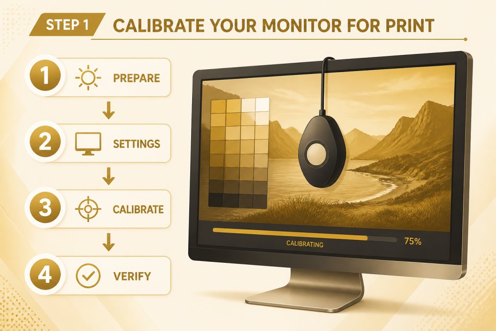
Monitor calibration is non-negotiable. Your screen is almost certainly not showing you accurate colour. Most consumer monitors come uncalibrated from the factory, often too bright, oversaturated, and skewed toward blue or warm tones. This means everything you see on screen is already distorted before you even start the printing process.
Calibration brings your monitor into a known, predictable state by measuring how your display renders colour and creating a colour profile that corrects for its quirks.
Using built-in calibration tools
Most operating systems include basic calibration tools. On Windows, search for "Calibrate display colour" in Settings. On Mac, use the Colour LCD utility in System Preferences under Displays. These tools walk you through a visual process where you adjust brightness, contrast, and colour balance. The process takes 10-15 minutes and works surprisingly well for basic work, though it relies on your eye to judge accuracy.
When to invest in a hardware calibrator
If you're ordering canvas prints regularly, a hardware colorimeter (ranging from £70-£400) is worth the investment. Devices like the X-Rite i1Display Pro measure your monitor's actual output and create precise colour profiles. Hardware calibration is objective and creates far more accurate profiles than visual methods. The process takes 30-45 minutes and should be repeated every 2-4 weeks, as monitors drift over time.
Step 2: Set Up Soft Proofing for Canvas
Soft proofing is the closest you'll get to seeing what your print will actually look like before you order it. It uses your calibrated monitor to preview how an image will appear when printed with specific CMYK inks on canvas.
Open your image in design software (Adobe Photoshop, Lightroom, or Affinity Photo), select a canvas print colour profile, and enable soft proof mode. Your monitor then displays the image as it will appear on canvas, accounting for CMYK gamut limitations.
Most professional canvas printers provide ICC profiles for download. Download the correct profile for your canvas choice (matte, glossy, textured) and import it into your design software.
In Photoshop, go to View > Proof Setup > Custom. Select the canvas printer's ICC profile from the dropdown and enable "Preview" to see the soft proof in real-time. Adjust your image accordingly, boost contrast if colours look flat, dial back saturation if it's too intense, or tweak individual colour channels to compensate for known shifts.
Step 3: Prepare Your Digital File with Correct Colour Profile
How you prepare your file determines whether colour accuracy is possible. A poorly prepared file, wrong colour space, or no embedded profile will print unpredictably.
Choosing and embedding ICC profiles
An ICC profile tells the printer how to interpret colour data. Every printing device has its own profile. Obtain the correct ICC profile from your canvas printer, specific to the canvas type you've chosen and the ink system they use.
In Photoshop, go to Edit > Assign Profile and select the canvas printer's profile. This embeds the profile in your file and tells the printer how to interpret your colours. When you export, choose "Embed colour profile" in the export dialog.
Converting to CMYK without losing colour fidelity
If your image is in RGB, you'll need to convert it to CMYK for printing. In Photoshop, go to Image > Mode > CMYK. Select "Relative Colorimetric" as your rendering intent, this preserves colour relationships while mapping out-of-gamut colours to the nearest in-gamut equivalent.
Before converting, apply your soft proof and make colour adjustments in RGB mode. Then convert to CMYK. Work non-destructively by duplicating your layer and keeping the RGB original as backup.
Step 4: Account for Canvas Texture and Viewing Environment
Canvas texture is invisible in digital files but visible on the printed product. The woven texture softens fine detail and affects how light reflects off the surface, changing how colours appear.
Canvas requires lower resolution than other print media. About 150 DPI (dots per inch) is sufficient for sharpness, as the woven texture softens fine detail. Professional printing typically achieves Delta E values below 2 (a measure of colour difference).
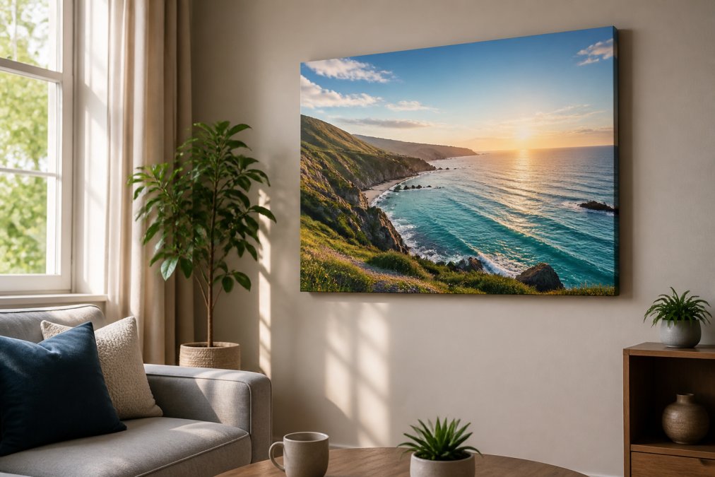
Viewing environment matters enormously. The same canvas print looks different under daylight, warm incandescent bulbs, and cool LED lighting. View your print in the actual lighting conditions where it will hang before ordering.
Avoid very fine lines and extreme contrast changes that texture will obscure. Increase contrast slightly in your original image to compensate for the softening effect of canvas texture. Matte canvas absorbs light and shows colour most accurately. Glossy or semi-gloss canvas reflects light, making colours appear more saturated but introducing glare.
Common Colour Shift Issues and How to Fix Them
Skin tones shifting toward orange or red. This is the most common complaint. In soft proof, if skin looks too orange, reduce yellow in the image (Image > Adjustments > Hue/Saturation, select Yellows, reduce saturation slightly) or add a touch of cyan to cool the tone.
Blues and purples appearing desaturated or grey. Blues sit at the edge of the CMYK gamut and often can't be reproduced exactly. You can increase saturation in the original, but accept that some blues will be less vibrant on canvas than on screen.
Overall image looking flat or low-contrast. Canvas texture naturally softens contrast. If your soft proof looks flat, increase contrast in your original image before converting to CMYK. Boost blacks slightly and brighten highlights.
Colour banding in gradients. Add subtle noise to gradient areas (Filter > Noise > Add Noise, set to 1-2%) to break up banding without being visible to the eye.
Unexpected colour shifts after printing. If your print arrives and colours don't match soft proof, contact your printer immediately with your soft proof image and the print. Reputable printers will reprint if there's a genuine colour accuracy issue.
Dye-based inks fade visibly within 2-5 years under normal domestic lighting. Archival pigment inks are rated fade-resistant for 75+ years with UV-resistant coating. If colour accuracy matters, insist on archival pigment inks.
Getting canvas print colour accuracy right transforms the entire experience. You move from hoping your print looks good to knowing it will. The process isn't complicated, it's just systematic. Calibrate your monitor, soft proof your image, prepare your file correctly, and account for the physical reality of canvas texture and lighting.
paints2prints offers customisable canvas sizes and finishes specifically designed for home decor. Their free shipping across the UK and EU means you can order with confidence, knowing you've done everything on your end to ensure colour accuracy. Start with a single print using these steps, and you'll immediately see the difference a proper workflow makes.
Frequently Asked Questions
Why do colours look different on my screen compared to the canvas print I received?
Most computer monitors are too bright and oversaturated compared to actual print output. Without monitor calibration and soft proofing, your screen shows colours that cannot be reproduced on canvas. Additionally, RGB (screen) and CMYK (print) colour spaces have different gamuts, some vibrant screen colours simply don't exist in the printable colour range. Using soft proofing and ICC profiles before sending your file to print bridges this gap and ensures what you see on screen matches your finished canvas.
What is an ICC profile and why does it matter for canvas print colour accuracy?
An ICC profile is a digital file that describes how a specific device (monitor, printer, or canvas type) reproduces colour. It acts as a translator between your design software and the printing equipment. Embedding the correct ICC profile in your file tells the printer exactly how to render each colour. Professional printers use profiles calibrated to their specific equipment and inks. Without the right profile, colour shifts and inaccurate reproduction are almost guaranteed. Paints2prints provides colour profiles tailored to their printing process, ensuring consistent results across all orders.
Should I use RGB or CMYK colour mode when preparing my canvas print file?
Start in RGB if you're designing on screen, but convert to CMYK before sending your file to print. RGB has a wider colour gamut and is what your monitor displays, but printers use CMYK (cyan, magenta, yellow, black) inks. The conversion from RGB to CMYK can cause colour shifts if done incorrectly. Use soft proofing with your printer's CMYK profile before conversion to see exactly which colours will shift, then adjust your design if needed. Always provide your final file in CMYK with the printer's ICC profile embedded.
How often should I calibrate my monitor to ensure accurate canvas prints?
Calibrate your monitor at least once every two weeks if you regularly design or order prints. Monitors drift over time as the backlight ages, and environmental factors like room temperature affect calibration accuracy. If you're ordering multiple canvas prints or working on a series, weekly calibration ensures colour consistency across all prints. Document your calibration date and settings so you can track when recalibration is needed. For professional results, consider a hardware calibrator rather than relying on software-only tools, as they measure your monitor's actual output rather than estimating it.
This article was written using GrandRanker
0 comments